I recently posted a Reddit post that caught some traction on poor signage design. What caught my eye for the post? The signs at Maxwell MRT were so badly designed, station staff had to hop on PowerPoint and design a few supplementary paper signs.
New MRT signs so bad Maxwell MRT had to improvise
byu/enewssg insingapore
Reading through the comments, it feels like many have echoed the same sentiment – the recent revamp of signage on the MRT, and signage as a whole, is very lacking, or at times, forgotten.
Stations are getting more and more complex over time as the system grows – places like Outram Park and Dhoby Ghaut have increasingly had more lines added to it as they grew. Just check out this 3D map of Outram Park from Twitter user @adamm_apple.
This growth lead to an issue – how does LTA make ~25 year old signage designed for a MRT system of three lines, work in todays MRT system?
LTA recently the decided to rework the signs. But this rework isn’t an improvement to the signage. Here’s why.
Fair warning: I am just a person who takes the TEL daily, and interested in public transit, but I have not much experience in design. These are just my thoughts on this matter since I had time!
The issue
Here is the commuter thought process when you exit with the new signs, compared to the older design:
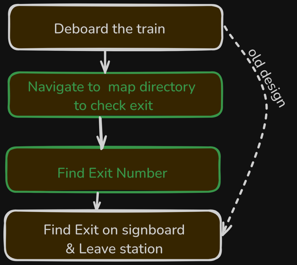
Notice the issue? This new process brings in two new steps (green), slowing down peoples exit and usually make people walk further. It also makes signs harder to use, making extra steps necessary to use them.
This idea contrasts with what the architecture director of LTA said in an interview relating to this signage redesign.
Wayfinding signs have to be easy to use, and easy to understand.
- Tan Swee Lin, Deputy Director (Architecture) | LTA.
But why even redesign the signs to be like this? Well there is actually pretty good reason.
The New System
Reading this blog post on the MRT signage redesign, it seems that a new ‘hierarchy of signage’ was introduced, with an attempt to clean up the clutter of words.
It makes sense, a system designed for Singapore in the 2000s is likely not going to work well now.
The following issues were identified as part of the problem statement in the redesign:
- The existing system was not designed for expansion and complexities.
- Commuters are conditioned to look for information at the wrong places.
- Operators continually adding more info to ‘meet commuter needs’.
If a commuter is lost, the idea would be for them go to the information points installed with maps to find out where they need to go.
The new system prompts people to ask the right questions and think about whether they can answer the questions themselves.
- Samuel Lim, one of the designers, from this blog post.
With this, I found issue with two of the new design choices.
Firstly, the requirement for you to crowd around a information point to see where you go slows down your commute.
Secondly, I still think it is essential to have landmark names on signs. In places where I navigated new metro systems like London, I relied on this for a fast and quick exit of the station, and they worked great. London has much bigger and complex stations compared to Singapore too. It looks like the station staff agree too if they had to put up those temporary signs.
One comment put it very well – the new redesign is “unnecessarily allergic to words”.
LTA also claims to have done “extensive research and testing” on the system. I am starting to doubt that though, after reading the responses to the Reddit post.
Ironically, the idea of this redesign seemed to partly stem from the usage of makeshift paper signs. Lets look back to the makeshift signs and its implementation. What exactly went wrong here?
The implementation
I feel that the ideas of the designers (at least from what I understand) was not implemented correctly.
Take a look at my Reddit post. Instead of the numbered exits showing ‘1-2’ or ‘3’, it just says ‘Way Out’, alongside the directory to the lower platform. Only on the supplementary sign is this information posted. Way Out signs like this only work when there are one set of fare gates in a station. Flash news, that is quite rare, and not present at Maxwell.
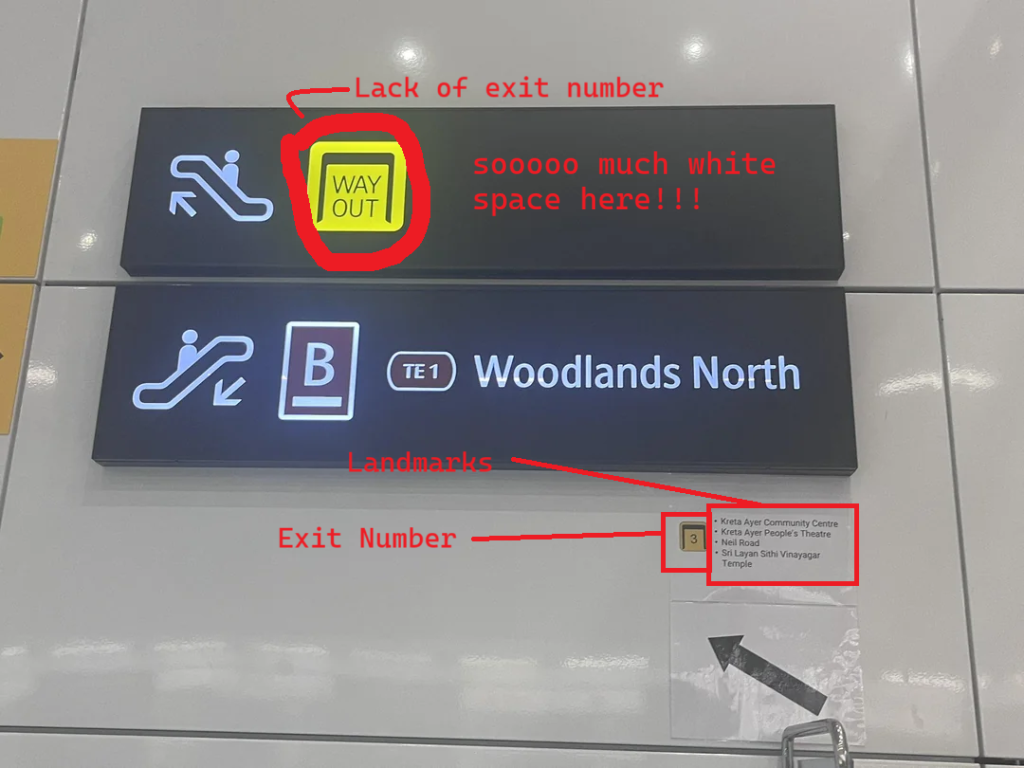
This means that in order to even find out what exit number is on which side of the platform, you would have to go up to concourse level, and then do wayfinding. The exit number should be where the ‘Way Out’ sign is.
Took a wrong gamble and ended up on the wrong side? Too bad, says LTA. You’ll need to walk across pretty much the entire length of the platform to get to the other side, due to the nature of how Maxwell MRT is built.
The fact that such makeshift paper signs still exist tell us that this is a response to commuters flooding the passenger service center with questions.
The tons of white space? That could have been used for the landmarks.
These signs have failed at their task. It is inadequate, especially for stations like Maxwell which sees many tourists each day. Inferring from nearby landmarks, most commuters at this station are not repeat commuters – people who live or work nearby.
Solutions?
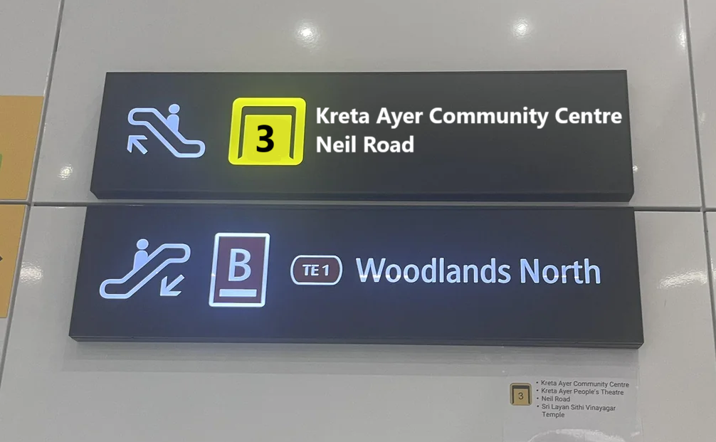
I opened MS Paint and drafted this very simple but (in my opinion) effective redesign in a few minutes.
Each sign has tons of white space – space that could have been used to tell commuters information they need at that point of time.
Instead of the ambiguous ‘Way Out’ sign, I also replaced it with Exit 3 logo, since that is where the escalator navigates to anyway.
I also chose landmarks that are permanent, so that a constant change isn’t needed. Stuff like roads, hawker centers, and community centers, are great things to add.
This example keeps things clean, while making wayfinding easy. By minimalising the amount of landmarks, while keeping them. Each landmark is also permanent, and not really prone to change.
People can just look at signs, or the information boards for the finer information, and exit easily. Simple.
It isn’t all that bad
The whole redesign wasn’t totally a flop though. I really liked a few things that they have done, such as the improved color contrast, and the use of yellow and black, which I have seen in other systems like in Japan, and work well.
The bigger and new icons, such as separating the toilet and lift icons, are great too.
Also, while I initially didn’t like the change of alphabets to numbers, the rationale was very sound. For non english speaking tourists, its really helpful, and numbers can be said in any language unlike Latin alphabets.
Other things like better/ more braille and tactile signs are things I’m sure that are welcomed too.
But the idea for this redesign, which comes out from the discussion of makeshift paper signs being used was not solved. If they are still being used at stations with the redesign in place, is hierarchy idea the redesign really working? I don’t think so.
Sources for this story:
New Signage System – Samuel Lim
Find MRT stations confusing? Enhanced signs aim to change that – CNA
The design of MRT signage | By Design
Singapore LTA System Identity – Move Architecture (From Web Archive)
One Designer’s Quest to Redesign Singapore’s Subway Signage – AOGA Eye on Design
Thank you for everyone on my post who shared some of these links too!
Thank you for reading! If you like what you see, consider joining my Telegram Channel where i post updates on the blog and other cool stuff I am up to!
Leave a Reply